Wednesday, March 31, 2010

Parish Church of Santa Monica - Vicens & Ramos

“The project whose is already completed is the third proposal. The first two were rejected and it’s a shame. I think that they were much more interesting, at least from the point of view of adherence to the liturgical rules of Vatican II.”
Vicens & Ramos

Following the guidance of the Diocesan Council of Temples and the program of requirements provided by the same and later adjusted to the needs of the Parish of Santa Monica, the building design integrates in one building all the spaces that correspond to Church, Parish offices and priest housing.

The generating idea of the project was that of situating, within the confusion of the surrounding urban environment, a building that would mark a milestone and become a continuos testimony to the spiritual function produced in its interior, and which must necessarily spread and manifest itself permanently to the nearby social and urban medium.

The intention to unify had priority in the conception of the building, that is long and narrow, curved to fit the road along its westerly aspect and cut off abruptly at the north-easterly face. Described by the architect as “an explosion, frozen in an instant after detonation”, the sculptural protuberances at the north end seem to jostle for the light, and almost resemble a hand pointing heavenwards.

The complex is made up of two independent buildings: one houses the church, strictly speaking, and the daily chapel, in a structure with large steel porticos, while a second block with a structure of reinforced concrete accomodates the housing and parochial rooms. Both are tied together by a continuous corten stell skin which, as a whole, creates a piece that gives an image of great unity and rotundity.

The northern and southern façades are symmetrical except in the building of parochial spaces, where on the northen face the steel skin curves to form the main access to the nave.

At the foot of the nave is located the High Chore, which can be accessed directly from the nave by a stairwell and has a seating capacity of 77 and a common lightning system with that of the rest of the nave. The most public and daily zones turn towards the Avenida de la Integración, while the bedrooms face the interior street.


Vicens & Ramos
Photographs: Pablo Vicens y Hualde & Ricardo Santonja
taken from ArchDaily

Tuesday, March 30, 2010

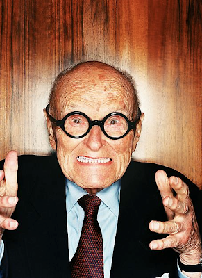
Philip Johnson

I love this photo of Philip Johnson - who do you think he wants to strangle?

Friday, March 26, 2010

Raumstation Irnharting - X Architekten


X Architekten

SLC Foster Art Program

Over the past few of months I have had the opportunity to participate in the SLC Foster Art Program as a recipient. I selected a painting by Thomas Aaron. The painting was one of a series and dealt with the abstraction of urban form and spontaneous creation. As part of the series, local authors produced poems that coincided with each painting, below is the corresponding poem entitled "A Mystical Experience".

Sadly, today I have to give the painting back. There is no doubt that there will be a void not easily filled in our dining room and in the lives of my children, who love this painting.


A Mystical Experience

Ethan William Higbee

So at last the ignitions of energies burst inside confinements of worries, like walls and the warped eyes of defeat, douse themselves to keep warm, but still they have cold feet.

Oh Urania, Pure harmonium of stars, planets and oh, the orbit of moons. Saying,

"Come. Come young starlit man.
Breathe truth's light
And sing like a Vonnegut."

"One like any other.
Lost to the forces
of Tralfamadore."

But it is difficult, oh dearest of mine. It is hard for humans to see pure light. Our eyes lack the medium, or the canvas, in which to paint such visions. We are blindnesses walking through your kingdom and we are bloody weak. Our bones don not flex, they only fit a forespoken structure.

Oh lack of medium and dearest Urania.

Wednesday, March 24, 2010

SugarHouse Artist Residence Update

Just a little update on the progress of the addition I am working on.


Matt Gagnon Studio

Wooster Doors


A single pattern file was used to CNC route three layers for each door. Once cut the panels were mirrored horizontally and vertically to misalign the pattern and create a hollowed out porous surface. The three dimensional decorative surface also satisfies the prosaic task of door handle further obscuring the mundane kitchen supplies the doors are designed to conceal.

Matt Gagnon Studio website

Tuesday, March 23, 2010

Fame Agenda - Matt Gibson


Matt Gibson

Involving concepts of ‘transparency and illusion’ and bringing customers minds in-between interior and exterior this store plays on the perspective of the ‘arcade’. A random and organic set of arches inspired by Thomas Heatherwick's sculptural works merge to form a cave like enclosure from within the confines of the rectilinear shell. Providing intimacy and protection from the elevated & wind blown Docklands promenade the organic arches intend to shift the visitor inwards toward the end of the awkward ‘L ‘shaped plan & at the same time provide merchandising benches, walls and ceiling. The arches partially cover existing structural piers & terminate with mirrored cladding behind the sales counter seemingly extending the space and encouraging a play on perspective. The store presents its brand and hero through the use of strong architectural form and resourceful use of material. OSB panelling (used for everyday hoarding) makeup the Fame Agenda arches achieving a strong visual statement at low cost. Background walls are painted in a simple black gloss achieving a seeming infinity of depth. Materials combine rudimentary against slick, satin against glossy & provide an honestly & warmth carefully chosen so as not to overpower the product.

From Contemporist

Monday, March 22, 2010

Haus Szelpal - Felber Szélpal Architekten


Architects: Febler Szelpal Architeckten ag, Solothurn
Location: Solothurn, Switzerland
Contractor: Galli AG, Surface and Civil Construction
Structural Engineering: BSB+Partners, Engineers and Planners
Furniture: Theo Jakob AG, Berne
Project Year: 2006
Photographs: Bruno Helbling, Zurich

The narrow form of the property together with its descending topography has amazing architectural consequences on the house itself.

The result is an elongated cube with two floors on the basis of an S-shape in section. Because the plot is inclined lengthwise, the interior corresponds with the spaces outside on opposite ends of the building depending on the floor. The entrance on the ground floor is on a level with the site to the east front, whereas the garden can be reached to the west from the terrace above.

A marvelous view on the entire alpine panorama can be caught on the upper floor, a quality which brings in a hierarchy between above and below. Beside the entrance and the carport, the ground floor consists of other serving rooms like the office, the utility rooms and the cellar. All the main rooms for living are situated above, they are almost entirely oriented towards the view.

The monolithic concrete body has an elegant attitude, it appears clear and hard outside, while it is soft and warm inside. By its internal insulation, the construction can be adapted to changing needs of the family in a simple and economical manner also later on. The statics can easily be recognized outside, a long strip of a ribbon window relates the house to the panoramic view.

The building is inserted into the site without effecting much earthworks. Surrounding plants, flowers and trees create a powerful contrast between figure and nature.

taken from ArchDaily.