Tuesday, December 22, 2009

Evanston Road Trip + Roundhouse

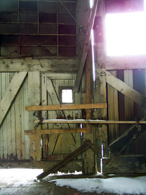
Yesterday Bill Miller, Sophie Masse and I traveled to Evanston Wyoming to investigate the site for our next studio project - the Evanston Roundhouse. Evanston City has already begun the renovation of the Roundhouse as well as other key buildings within the masterplaned area. Currently, section 1 of the Roundhouse is used as a community center and the remainding 3 bays will be the future site of the Evanston City Hall.

Historic Photos


Evanston Roundhouse


Renovated portion of the Roundhouse


Machine Shop


Future Visitor Center


Powerhouse


Thursday, December 17, 2009

OlsenBeal progress

The translation between design/drawings to the built work always amazes me. Sometimes that translation exceeds expectations and then there are those other times. The times when you visit the job site and say to yourself, "what the hell is this?"

I had one of those moments yesterday on the job site. I had designed a detail where the interior steel frame was to appear to support the secondary frame that generates the cantilevered canopy - one steel section directly on top of the other. The canopy steel is supported by a series of vertical columns, but it was to look like one steel section was resting on the other. Well, when setting the steel they were off by about 4 inches, resulting in a gap between the two. this they decided to patch with soffit material - problem fixed right? - No way! It looks like a racing stripe giving a halo to the entry. We decided to paint the stripe to match the steel and hopefully it will blend in.

In contrast, seeing the corten steel panels going on the building is pretty exciting. They are beginning to have a nice patina and should add a sense the passage of time to the building. The window frames turned out realy nice too; I only wish that they protruded a little more from the facade.

The other day I decided to write a little about this project for my portfolio. Here is what I had to say.

OlsenBeal Company is a steel fabrication and wind generation shop; specializing in bridge construction and wind turbines.

The concept for their addition came from a desire to express what kind of work OlsenBeal is engaged in and the materials that they work with on a daily basis. With this in mind, I wanted to use as much reclaimed material from their steel yard as possible; not only for the structure but for the aesthetic treatments as well. What began to emerge was a coming together of elements that not only expressed their materiality in the truest sense, but allowed the building to be a instrument of education and everyday performance. New and old materials are used to give a sense of permanence as well as demonstrate the transformational qualities of materials over time. Heavy, rusticated brick allows the building to be grounded while the corrugated metal reaches skyward. A corten monolith intersects all the other materials and is a demonstration of the timelessness and realities of building; being allowed to rusticate and age over time.

The structure allows for an interesting interaction with those who visit and work within the spaces. By removing the corner of the building and allowing visual access to the interior, not only can outdoor activity be monitored but a strong sense of entry and procession occurs. This is only accentuated by the suspended steel canopy that seems to stretch horizontally into the landscape. The strong, round steel column that marks the entrance not only stands as a placemaker/spacemaker but is an “axis mundi”; an element that connects earth to sky and sets the building in order.


Friday, December 11, 2009

Beacon on 100 interiors

Below are the developing interiors for Beacon.

As a point of interest, myself and Derrick Tornow (developer) met with Provo City's Design Review Committee yesterday to present our project and receive feedback. It was like being back in school presenting to a jury - but with real consequences! The project that presented before us got totally ripped apart. One committee member said that he totally hated the project - pretty strong words. And the firm that did the building is one of the larger, well known firms in Salt Lake, I won't mention names. I am sure it didn't help that the individual representing the firm sounded and acted like a complete moron. "Dude, you are a professional, get your act together". Honestly, the design was junk though. I was a little nervious being the following act, but from the get go I knew it was going to go really well for us. Long story short, they loved it and the new direction we were taking with our design - very urban, both in style and site strategies. They are looking forward to this project setting a precedent for development of this kind in Provo - those are big shoes, but exciting shoes. I have to give credit to Provo for wanting to promote urbanism and a client that has a great vision for his developments. It is a very exciting time.


Wednesday, November 25, 2009

Portfolio Revised - Sneak Peek

As I always do (never being satisfied), I began tinkering with my portfolio yesterday. Lately I have been having a strong urge to write about my projects and to include that information in my portfolio. I have to admit that there is an ulterior motive as well that is pushing me along. I am planning on applying for a couple visiting faculty positions and need to get my "stuff" in order. The images below would be apart of a two page spread. Let me know what you think!


Tuesday, November 24, 2009

OlsenBeal update

Here are the most recent construction photos from the OlsenBeal Addition. The corten panels are going up and the exposed steel has been treated. Insulation and drywall is starting this week and the brick and corrugated panels will be going up in about a week and a half.


Friday, November 20, 2009

Beacon on 100

Here is a sneak peak at a project that I am designing at Scholz. It is located in the heart of conservative Provo, but surprisingly I think the city is going to go for it. The city wants to set this as the precedent for new construction of this type in the city. We are incorporating many urban design principles and sustainability concepts into the design and may go after a LEED certification on the project. To my knowledge it would be the first of its kind in all of Utah County.

11-23-09
I just received an email from the city planner assigned to our project. He told me that he doesn't like the windows. Hum, stick to planning buddy!


Wednesday, November 11, 2009

Wasatch Elementary Artist Evening

Last night I was invited to display and talk about some of my architecture to elementary school students at Wasatch Elementary. I was part of a group of 20 local artists that were asked to participate. I brought my masters project model and a few sketches, including sketchbooks from Spain and India.

I wanted to show examples of contemporary design (both my own and others) to talk to the kids about imagination and broadening their vision for what architecture is and more specifically what a home could be. It was fun to see their eyes light up when they saw some of the "funky" designs from some of my books and some of the sketches that I have done. I asked a few of them if they could see themselves living in some of the houses from my book and the answer was an absolute yes. This gives me a lot of hope for the future generations and their appreciation of what could be in architecture. These little people are the ones that we should be educating in art and architecture.

The highlight of the night was my "Hip Hip Architecture" model for sure. The kids loved seeing all the little people in the model and almost fell over when I took it out of its base and then pulled it apart so they could see inside it. It was fun to be able talk about building sections, model making, sketching, and imagination. The kids were fantastic!


The kid in the red shirt loves architecture and wants to be an architect. I told him that I hear many people tell me that they thought about being an architect when they were younger but never did it and that he should follow his dreams and never give up. I think he probably went straight home and downloaded sketchup.


The kid holding the model asked me about a million questions. "Have you ever thought about designing a building that floats in the sky?" "Have you ever thought about designing a building that is in the ocean?" "Have you ever thought about designing this building with really tall towers on it?" "Have you ever designed a building that is in the mountain?"......... I think you get the idea. I think he was at my table for at least 45 minutes. Don't worry, the guy on the right didn't want to kill me, he just looks that way.


This little guy wanted to trace all of my sketches from my sketchbook. I handed out tracing paper to all the kids that came by and they had fun drawing. One kid I asked to draw me a house and so he did. It was the typical pitched roof with a central door and windows on the sides. Then I showed him a photo of a contemporary house that had a ribbon structure that formed the walls and roof. He immediately started to change his drawing and do some crazy stuff to it. It is fun to see a young mind change in an instant.


Tuesday, November 3, 2009

sketching

The other day I took my students on a sketch day and visited a couple places in Salt Lake City. While my students were busy sketching I decided to rest and do a sketch of my own. Here you go.


Other Sketches

Tokyo, Japan

Salt Lake City Library, Utah

City Palace, Palma de Mallorca, Spain

Details, Segovia, Spain

Parc Guell, Barcelona, Spain

Barcelona, Spain

Alley, Tokyo, Japan

Figurines, Japan

Shack, Japan

Section, Kyoto, Japan

Site Plan, Kyoto, Japan

Cathedral, Valencia, Spain

Antelope Island Visitor Center, Utah

Antelope Island Visitor Center, Utah

IMAX Theater, City of Arts and Science, Valencia, Spain

Concept sketch

Cuenca, Spain

Door Rubbing, Segrada Familia, Barcelona, Spain

Watts Towers, California